25 Oct Missing Etsy Features
The Etsy team has created a full-featured marketplace for handmade and vintage artisans. In six short years, the site has grown as a user-friendly, well designed hub for artists, crafters and collectors alike. Even this beloved purveyor of handmade isn’t without its imperfections and missing features, however.
Since Etsy doesn’t share their roadmap of upcoming features nor pay much heed to the Etsy Ideas team, sellers are often left dreaming of the day their pet features see the limelight. I’m no exception, and today I’ll point out three critical features that Etsy needs – and show how they might be done.
[box type=”info”]Update: Since this article was published, Etsy has released a new custom order process and listing variations, addressing the first two missing features. The shop landing page remains unaddressed. See my Missing Etsy Features 2013 article for the next batch of features that Etsy should focus on.[/box]
Custom orders
Etsy encourages custom orders, one-of-a-kind creations made at the request of a customer. The Shop Settings section of Etsy even has an option to enable a “Request Custom Order” link on your shop to help buyers start a conversation about a custom item. When it comes to selling the item, Etsy drops the ball.
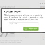
Selling a custom order means putting up a normal listing with a special title and sending the link to the customer. Sounds simple enough, but this goes wrong surprisingly often. The most glaring problem is that there’s no security – since it’s a normal listing, anyone can buy the custom item. Often, the person buying the custom item has the same first name, so even a vigilant seller might not realize the wrong person purchased the item. At best this causes a little confusion and a few fees; at worst, a discounted and unique item can get sent to the wrong customer and put the seller in a real pickle.
 Etsy could provide custom order functionality when listing an item to address this problem. A checkbox that says “Is this a custom order?” could generate a simple code when checked, which a buyer must provide to purchase the item. Allowing the seller to set the code would be nice, but a randomly-generated code would work just as well.
Item options
Similar to custom orders, many sellers allow simple customization of items by telling buyers to specify a color, type of stone, fabric or other options in the note section for an item when checking out.
What if the buyer didn’t put anything in the notes? Does that mean that they want the default option, the color pictured, or simply that they forgot to specify or didn’t know they had an option? This ambiguous situation isn’t the best experience for the customer, and the back and forth to prevent it can be a hassle.
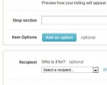
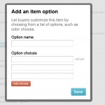
Many sites will allow a buyer to choose a few simple options before purchasing the item, such as a size and color. The difficulty for Etsy is knowing what options the seller might want to add – which is why my solution makes no assumptions and lets the seller define the options themselves. To minimize confusion for inexperienced sellers, the listing page adds a single optional line with a button to launch a custom options window.
Shop landing page
My pet peeve on Etsy is checking out someone’s shop and being thrown into a random mess of items. Many Etsy sellers don’t know about Rearrange Your Shop, and even that tool only allows minimal organization. Shop sections are a great way to organize your shop and make it easier to navigate, but Etsy does not use them to the fullest on the main page of shops.
Etsy’s Discover pages offer some inspiration for my solution – group items on the shop home page by shop section. It wouldn’t work for those without shop sections or enough items, but perhaps those sellers can continue to enjoy the quagmire of the unforgiving grid until they add or categorize items. Which do you prefer?
The shop landing page as it stands works well when shop content is similar, but falls flat when a seller has diverse items. Etsy discourages sellers from creating multiple shops – yet the extra shops are often used to bring a cohesive experience to each type of item the seller makes. Shop sections on the landing page would help to ease the pain.
What are your missing Etsy features?
Get my latest articles straight to your inbox about once a month. Learn how to improve your Etsy shop, boost your sales and discover other sellers from the Etsy community.


No Comments