31 Jan Missing Etsy Features 2013
It’s been a busy year for Etsy since my Missing Etsy Features article; the keen minds behind the scenes rolled out direct checkout, Etsy gift cards, new ways to browse, a wedding registry, and apps for iPad and Android. There were even nods to my last article with the addition of listing variations and an improved custom order experience. Etsy is furiously polishing, but there are still plenty of rough edges on the site.
Etsy understandably has a bias for features that will keep the site profitable, rather than less-quantifiable seller happiness features. I’m starting off this year’s missing features with two hard-hitters that can truly affect Etsy’s bottom line.
[box type=”info”]Update: Since this article was published, Etsy has released a big improvement to the forums and made conversation archiving a reality.[/box]
Guest checkout
Etsy requires signing up for an account before placing an order. It’s easy to forget this as sellers, since we treasure our Etsy accounts dearly. Etsy’s efforts with Google product listings have led to many new buyers landing on the site for the first time, intending to buy a product, only to encounter this serious friction.
The pain is familiar to most of us that have landed on a new site and been asked to create an account. It stops an order in its tracks. What should I use as an account name? Oh, mine is already taken – time to get creative. I need to think of a password and I’ll probably re-use an existing one so I can remember it. I don’t want to get spammed by this site. Why do I have to fill out so much information? Forget it, I didn’t want those napkin rings that badly.
Guest checkout introduces new problems – order tracking and communication, seller protection – but these aren’t insurmountable. Competing sites have had this feature for a long time. Etsy can quickly appease the sellers opposed to this idea by making it a configurable option for shops.
Faceted browsing
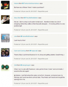
It’s no secret that browsing on Etsy has its challenges. The Etsy Ideas forum is alight with complaints about the difficulty of browsing the site. Faceted browsing is a fancy term for allowing shoppers to apply filters to narrow down the number of results. Amazon employs this strategy to great success on its site; you can narrow down by color, shipping options, and even category-specific criteria like age-appropriateness for kid’s toys.
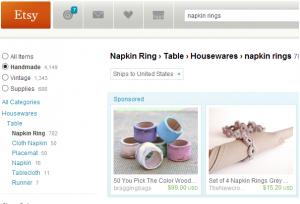
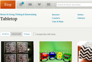
It’s mystifying that Etsy doesn’t offer faceted browsing, since this exact technology is already in use on the site when searching. Let’s compare a search for napkin rings with an effort at browsing for napkin rings.
Searching, I’m able to narrow the results by diving into categories – Housewares, Table, Napkin Rings. At this point I’m being shown only napkin rings. Browsing, I narrowed by Dining & Entertainment, and Tabletop. I can’t go any deeper; I’m being shown centerpieces, coasters, table runners, wine labels, candle holders and thousands of other items unrelated to what I’m looking for.
Etsy’s browse improvements have gone a long way to making casual shopping easier, but without faceted browsing most categories are still far too overwhelming. Showing deeper categories as in search would be a good start; adding in color and material filtering are big next steps. Again, this is a little mystifying since Etsy already records materials for items and doesn’t use them other than in individual listing pages.
I feel strongly that these two improvements would measurably increase Etsy sales. Sales aren’t the only eggs in the basket, though. Sellers are what makes Etsy tick; Etsy’s CEO Chad Dickerson even formed a Seller Happiness team upon taking the reigns. The other three features on my 2013 grievances would greatly improve the seller experience on Etsy.
Forum improvements
The Etsy forums are a wonderful place to exchange ideas, get help and shop tips, and shoot the breeze with other sellers. The forums lend a sense of community to what might otherwise be a lonely selling experience. It’s not all peaches and cream, though – often the forums can be quite a maddening place to visit and keep up with.
Any topic in the forum that goes over a single page becomes difficult to follow. Etsy is missing a basic feature to keep topics organized – conversation threading. Conversation threading means that you can reply directly to a single post, rather than reply to the entire topic, possibly several pages after the person you’re addressing. If you’ve ever seen sellers copy and paste a previous post into theirs to give their comment some context, you know what I’m talking about.
Etsy could run into issues with horizontal space with deeply-nested replies, but having at least one level of threading would greatly increase the readability of the forum.
The forums are also filled with sellers replying simply to agree with an earlier post, cluttering up the thread. I hate to steal so blatantly from Facebook, but Etsy needs a Like button on forum posts so that sellers can give kudos to a post without adding to the mess.
Packing slip
Etsy has put a lot of work into direct checkout and shipping labels to make on-site sales a pleasant experience – the place where they falter is packing slips. Etsy’s invoices include full-color photos of the item, a real ink-killer. Switching the printer to black and white instead of full-color will save some late-night trips to the office supply store, but it’s still not ideal. I’d like to see Etsy add a simple packing slip that’s printer-friendly for sellers who want to include it in their shipments.
Conversation archiving
I saved the best for last – my personal pet peeve. Etsy has created a close relative to email with conversations. I love that customers can converse with me easily without being kicked into an email program. Unfortunately, Etsy has swung and missed when it comes to organizing my conversations. The default view shows all conversations that I’ve ever had on Etsy.
Etsy supports adding convos to folders, but it doesn’t remove the conversation from view. That’s the rub of making something very akin to email – suddenly it’s glaringly obvious which features are missing that are available in any modern email application. The lack of any inbox concept means that I can’t ever archive a convo to hide it without deleting it. I’d like to keep my convos around so I can search them, but having dozens of pages of convos in my “inbox” is causing a major OCD flare-up!
Etsy no doubt has a slew of features lined up for 2013; I can only hope that some of these make the list. Etsy, if you’re listening – forget all the other features I mentioned and give me conversation archiving! What are your missing Etsy features?
[flickr]Cover image by Steffen Zahn on Flickr.[/flickr]
Get my latest articles straight to your inbox about once a month. Learn how to improve your Etsy shop, boost your sales and discover other sellers from the Etsy community.


Sapphire Mountain Loft
Posted at 07:00h, 02 FebruaryThese would be wonderful improvements!
Would LOVE to see an upgrade in our Etsy ‘listings’ view where we could quickly adjust ‘prices’ as simply as we can ‘quantities’ (rows are right next to each other in listing view).
Also needed is when we update a shipping profile, site needs to auto-update ALL our current listings under that particular shipping profile as well, rather than our having to go through a multitude of individual listings to open and edit each one, taking a crazy amount of unproductive time (as has happened to many of us with the recent skyrocketing postal service cost increases).
We realize there’s a lot of work involved with a site the size of Etsy, and appreciate all their improvements; but as Brittany points out, so many of these are very basic improvements that have been in place by other sites for a long time. It helps if each of us contacts/emails Etsy directly with these suggestions so they know firsthand what sellers are needing.
Great job, Brittany! 🙂 🙂 🙂 Appreciate all your hard work!
Cherie
Posted at 16:00h, 01 FebruaryI agree with your points and hope some of these changes will come through. As for packing slips I create my own which highlights my shop banner and helps in firming up my brand image. As I have sales on other sites and locally I have found using my own packing slip is just easier.
Karen G
Posted at 05:44h, 01 FebruaryAwesome article and ideas. For me my big pet peeve is the lack of a packing slip that is simple. Drives me crazy. But all of your ideas would be improvements to selling on Etsy, which I absolutely love to do.